Free Threads UX design tips carousel template
UX Tip Cards
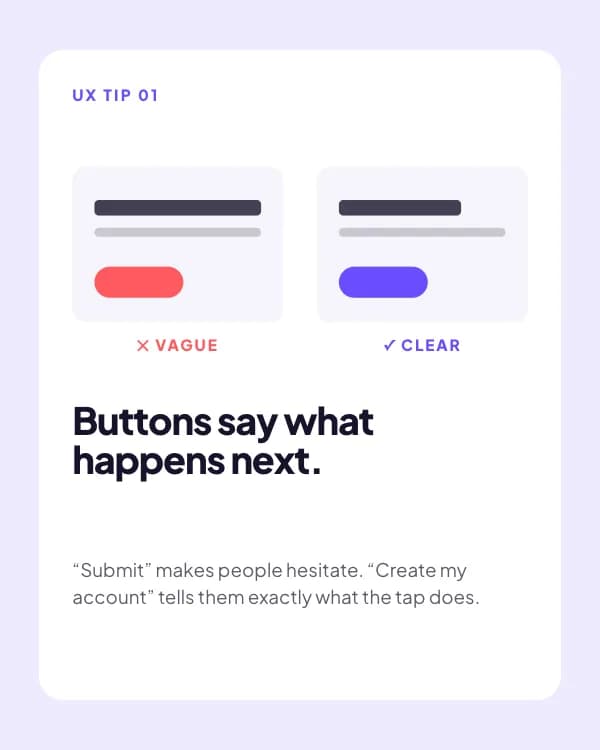
Design and UX tips as do/don’t spec cards: a mini wrong-vs-right mock on every page, the rule in bold and one line of why.
- Platform
- Threads
- Size
- 1080 × 1350 (4:5)
- Slides
- 6
- Price
- Free
Opens in the editor: describe your topic and AI rewrites every slide in this design, or edit it yourself.

What’s on the slides
- Slide 1
SAVE FOR YOUR NEXT DESIGN
4 tiny UX fixes that make apps feel expensive.
- Slide 2
Buttons say what happens next.
“Submit” makes people hesitate. “Create my account” tells them exactly what the tap does.
- Slide 3
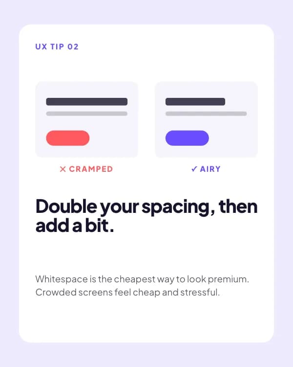
Double your spacing, then add a bit.
Whitespace is the cheapest way to look premium. Crowded screens feel cheap and stressful.
- Slide 4
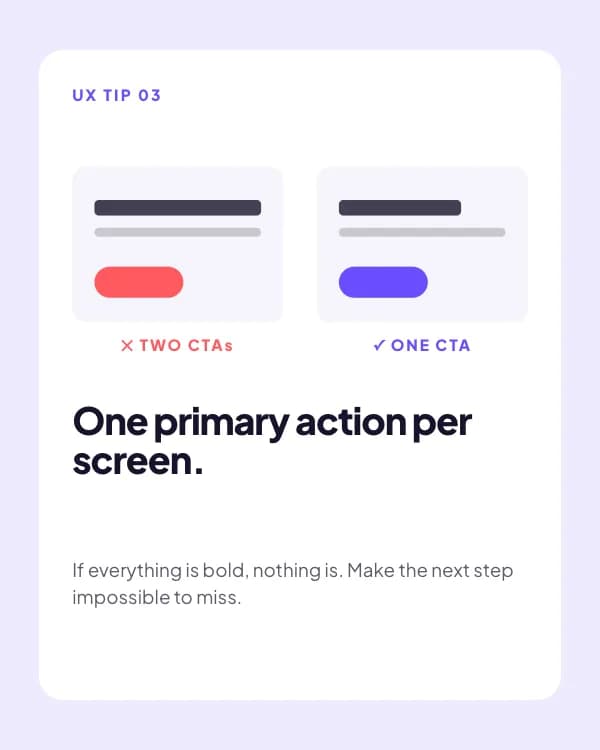
One primary action per screen.
If everything is bold, nothing is. Make the next step impossible to miss.
- Slide 5
Light grey text fails real people.
Aim for 4.5:1 contrast. Your users read on phones, in sunlight, on a bus.
- Slide 6
Which one is your app missing?
How to use this Threads template
- Open it in the editor with “Use this template”. No install.
- Make it yours: type your topic and let AI rewrite every slide in this design with matching photos, or change the words, photos and colours yourself.
- Export at 1080 × 1350 (4:5), one image per slide, and post.