
Free LinkedIn post formatter
Format your LinkedIn post just right to stop scrollers in their tracks
LinkedIn has no rich text editor. We built one. Style your post and copy in seconds.LinkedIn doesn’t have a rich text editor. We built one. Add bold text, italics, bullets, and a little breathing room — preview the result, then copy your finished post and publish in seconds.
Free LinkedIn text post format editor
Post Preview

Need more than 3,000 characters? Turn your post into a carousel
The case for it
A formatted post just
hits different.
𝗦𝘁𝗼𝗽 𝘁𝗵𝗲 𝘀𝗰𝗿𝗼𝗹𝗹.
Why creators format
The Difference Between a Pause and a Scroll
Stops the scroll
A bold opening line earns the first second of attention. Without it, you’re just text.
Reads like effort
Plain-text walls feel phoned-in. Formatted posts read like you cared — because you did.
More reactions
Scannable posts get more reacts, comments, and reshares than dense paragraphs. Every time.
Friendly to skimmers
Hierarchy and bullets help people on phones, in commutes, or with assistive tech.
How it works
How to Bold Text on LinkedIn
LinkedIn’s composer doesn’t have a bold button — so we made one. Type your post, highlight the words you want to emphasize, and hit B.
Behind the scenes we swap your characters for Unicode look-alikes that LinkedIn doesn’t strip out. The bold survives the paste — same goes for italic, underline, and strikethrough.
The toolbox
Ten styles in one tool.
You’ve got choice — make it wise. Mix and match, but go easy. The best formatted LinkedIn posts use one or two styles, not all ten.
Bold
Best for hooks, headings, and one phrase worth remembering.
Italics
Useful for quotes, asides, or a quieter note in the middle of a post.
Bold italics
When a phrase needs emphasis and a softer tone at the same time.
Underline
A subtle accent for short headings or a small point of emphasis.
Strikethrough
Useful for corrections, changed opinions, or a restrained joke.
Monospace
Good for labels, examples, snippets, or a line that needs to feel punchier.
Bullets
Six bullet styles to pick from. Useful when order does not matter.
Numbered lists
When order carries the point: steps, rankings, a process.
Emojis
One clear signal, a useful marker, a point worth noticing. Use sparingly.
Extra line spacing
Give the big idea room to breathe so the point is easy to find.
The playbook
How to format your LinkedIn posts like a pro
Make your posts easier to scan — without overdoing it.
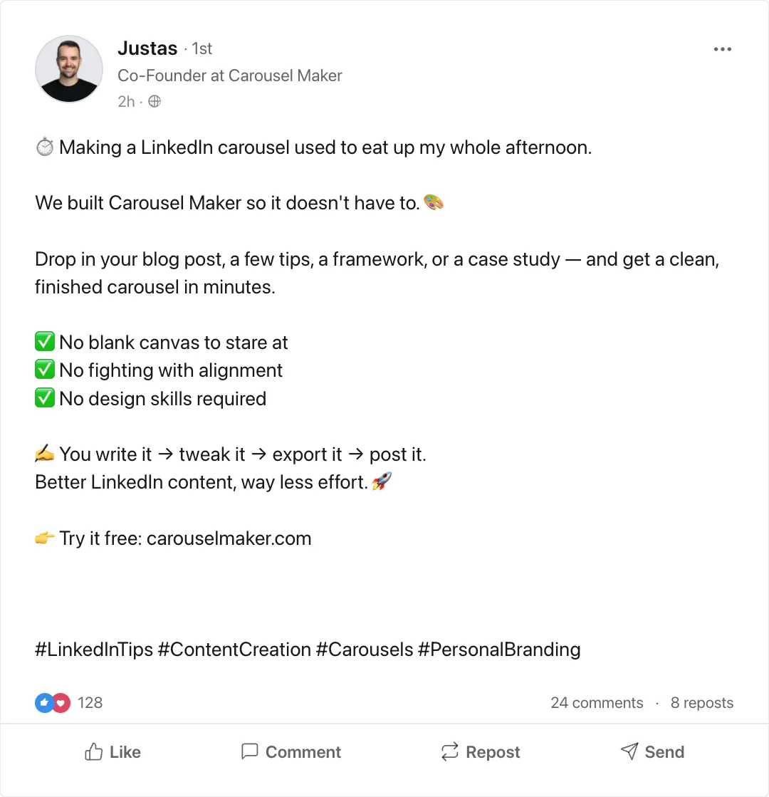
Make the opening line easier to spot
Use bold text or add extra line spacing where the hook deserves extra weight.
Break up longer posts
Spacing and bullets help readers follow the argument on a smaller screen.
Keep the formatting under control
One or two styles usually do the job. Your post should still feel like a person wrote it.
Preview before you publish
See the post as a LinkedIn card, check the rhythm, then copy the version that feels right.
Lists 101
Bullets or numbers?
Use bullets when the order doesn’t matter — features, takeaways, things you’re grateful for. Use numbers when order does — steps, rankings, a process.
That’s the entire rule. If you can shuffle the items without breaking the meaning, use bullets. Otherwise, number them.
How to add bullet points to a post
Type or paste your post into the formatter, highlight the lines you want to turn into a list, then choose a bullet style from the toolbar. Quick tip: when the items can move around without changing the meaning, bullets usually fit. When the order carries the point, use numbers.
The reference
LinkedIn post formatting rules and limits
The numbers that decide whether your formatting shows up — or gets cut off behind “…see more”.
| Post character limit | 3,000 characters |
| Visible before "…see more" | ~210 characters desktop · ~140 mobile |
| Comment limit | 1,250 characters |
| Headline (profile) | 220 characters |
| Hashtags that still look natural | 3–5, at the end of the post |
| Line breaks | Preserved — use them; blank lines add breathing room |
| Native bold / italic | Not supported in the composer — Unicode only |
| Bulleted lists | Not native — paste ▸ • ✔ → or number manually |
| Links in the body | Allowed; LinkedIn may down-rank posts that push people off-site |
Anatomy of a well-formatted post
- Hook line — one sentence, under 140 characters, so it survives the mobile “see more” cut. Bold sparingly: one phrase, not the whole line.
- Blank line — forces the reader to click to expand. That click counts as engagement.
- Two or three short paragraphs — one idea each, one to two lines. Italic for a quote or an aside.
- A list — bullets for takeaways, numbers for steps. Three to five items.
- One call to action — a question, or “save this”. Not both.
- Hashtags last — three to five, on their own line.
Over 3,000 characters? That is a carousel, not a post — the LinkedIn slideshow generator turns the draft into a PDF document post.
More free LinkedIn tools and guides
LinkedIn slideshow generator
Paste a post or URL, get a LinkedIn-ready PDF carousel.
LinkedIn post mockup generator
Build a realistic LinkedIn post image for decks, ads and previews.
How to post a carousel on LinkedIn
Specs, step-by-step upload on desktop and mobile, and common fixes.
LinkedIn engagement benchmarks
What a good engagement rate looks like in 2026, by post format.
Support
Frequently Asked Questions
Wait, this is really free?
Do I need to create an account?
Does it work in DMs and comments too?
How do I actually use it?
Bullets or numbers — what’s the difference?
Will this work on the LinkedIn mobile app?
Are Unicode fonts accessible?
Can I remove formatting?
What if my post is over 3,000 characters?
Is this just regular bold? Why does it look weird in some places?
Still have questions? Email us at [email protected]
Formatting handled. Need a carousel version?
Turn your post, article, or rough notes into a LinkedIn carousel — with our free carousel maker.