Free Instagram graphic design rules carousel template
Brutal Grid
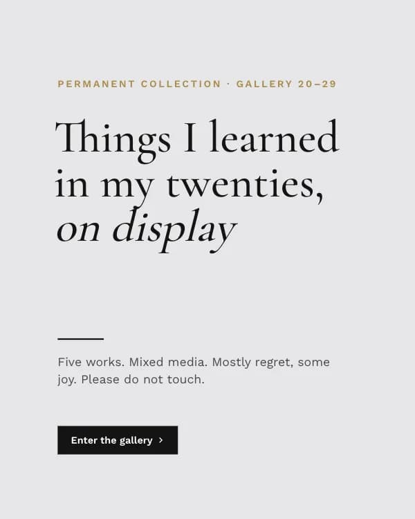
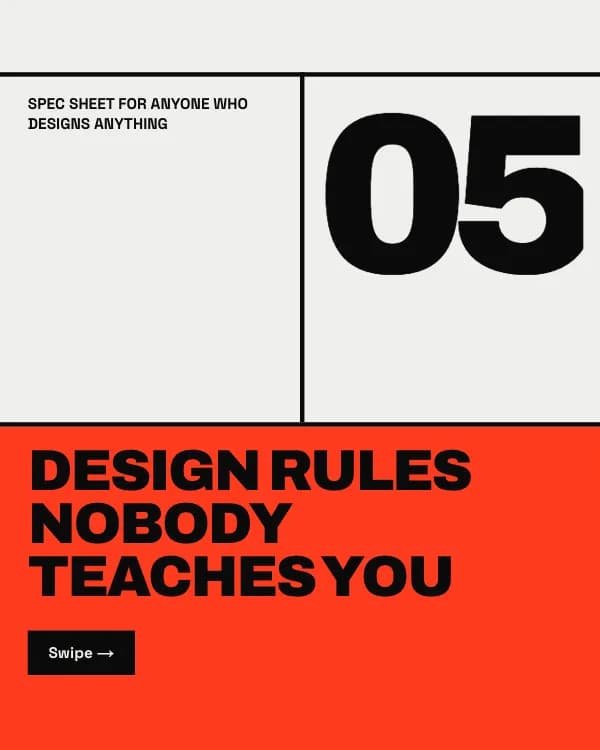
Design rules as a Swiss-brutalist poster: heavy black grid rules, a signal-red cell and giant numerals, one rule per slide.
- Platform
- Size
- 1080 × 1350 (4:5)
- Slides
- 7
- Price
- Free
Opens in the editor: describe your topic and AI rewrites every slide in this design, or edit it yourself.
What’s on the slides
- Slide 1
Spec sheet for anyone who designs anything
Design rules nobody teaches you
- Slide 2
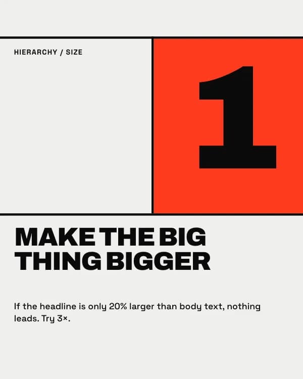
Make the big thing bigger
If the headline is only 20% larger than body text, nothing leads. Try 3×.
- Slide 3
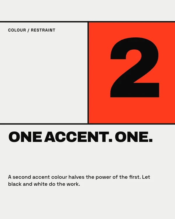
One accent. One.
A second accent colour halves the power of the first. Let black and white do the work.
- Slide 4
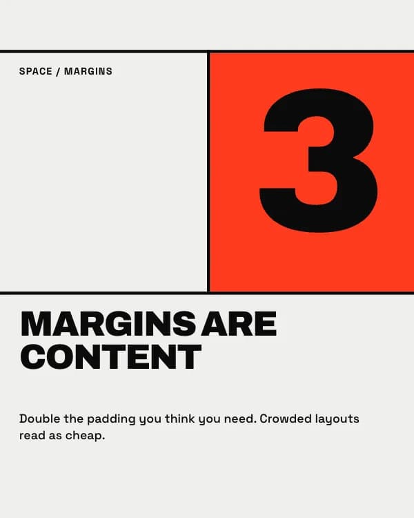
Margins are content
Double the padding you think you need. Crowded layouts read as cheap.
- Slide 5
Two fonts, max
One for shouting, one for talking. A third font is almost always a mistake.
- Slide 6
Align it or break it on purpose
Nearly aligned looks like an error. Snap to the grid, or go far off it.
- Slide 7
Save this before your next layout
How to use this Instagram template
- Open it in the editor with “Use this template”. No install.
- Make it yours: type your topic and let AI rewrite every slide in this design with matching photos, or change the words, photos and colours yourself.
- Export at 1080 × 1350 (4:5), one image per slide, and post.